outline
Sponsored by

Handling Multiple Choices Fields In The Dynamic Form Tag Helper
If you have been following the dynamic form tag helpers series, you must know that by now our dynamic form tag helper is able to generate a form for a given view model. The <dynamic-form> tag helper supports multiple levels of nested complex properties as well as some customization via the <tweak> tag helper and usual attributes(such as the DisplayAttribute).
In this post,we are going to tackle the support of form controls that allows the user to choose one or multiple values from a list.
Among these form controls we are going to focus on select menus, radio button groups and multi-select lists.
As usual the full code is available in the Github repository.
Implementing Multi-Choice Selection
In ASP.NET Core, choice selection is typically realized by using the <select> tag helper.
Consider the following strongly typed cshtml view:
Here the select tag helper has been used with the asp-for and the asp-items attributes respectively containing the SelectedItem and the ItemChoiceList properties.
Under the hypothetical SomeModel:
ItemChoiceListwill usually be anIEnumerableofSelectListItemcontaining the actual choices that are going to be displayed. This property is obviously passed toasp-itemsSelectedItemwill usually be astringor an integer (int,long…) that will contain the selected value when the form will be submitted. This property is obviously passed toasp-for
The previous select example will display a drop down menu that contains the elements specified in ItemChoiceList and that allows the user to select only one value as in the following screenshot:
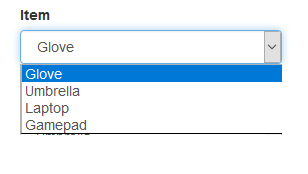
The select items belongs to the SelectListItem class which defines, among others, the Value and Text properties. A select list item is created as in the following expression new SelectListItem() { Value="1", Text="Glove"}.
The Text property contains the actual string that is going to be displayed for the item.
The Value property represents the identification data (usually a unique ID) that will be passed to the server to indicate which choice have been selected.
The selected choice’s Value will be stored in the view model’s SelectedItem property after the form submission. In our example if we select Glove, SelectedItem will contain "1".
Ì usually refer to the property containing the selected choice as the target property.
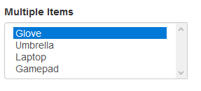
If we wish to allow the user to select multiple values, all we have to do is to change the type of SelectedItem to a List<string> or a List<int> and perhaps also the name to SelectedItems to make it less confusing. This will cause the rendering of the following multi-select list:
So, to sum it up in order to use the select tag helper we need to provide a list of items and a target property.
Specifying an Items Source for a Property
In our dynamic tag helper, we would like to allow the developer to specify in the view model class the properties for which multi choice form controls should be generated.
The previous capability is made possible by the [ItemsSource] attribute, consider the following view model class:
First, we define the Items expression bodied and read-only property. As you can see this property contains a list of select items.
Then, the [ItemsSource] attribute is slapped on the SelectedItem property which will contain the selected item’s value(target property). The ItemsSourceAttribute.ItemsProperty is used to supply the name of the property that contains the list of select items(Items in our example) which is going to be subsequently passed to the <select> tag helper internally.
Notice here how we used the new convenient nameof operator to avoid hard-coding the relevant property name.
The [ItemsSource] attribute allows the FormGroupBuilder to detect properties which form controls should be rendered as select elements. The FormGroupBuilder uses the reflection API to read the [ItemsSource] attribute instance if it is present and uses its methods and properties to properly generate multi-choice form controls.
The FormGroupBuilder uses the SelectTagHelper internally to build the form control, leveraging the existing SelectTagHelper allows us to support multi select lists by only changing the type of the target property to a List as described in the previous section.
Using a Group of Radio Buttons
Thanks to [ItemSources]’s ChoicesType property it is possible to use a radio button group instead of the usual drop down menu for single value selection cases.
Consider this alternative snippet from the PersonViewModel:
Here we passed a ChoicesTypes.RADIO flag to the [ItemSources] attribute which will be picked by the FormGroupBuilder that will generate the following form group:

In the previous example an input of type radio has been generated for each item of the Items list, the selected value will be of course set in the SingleSelected property when the form is submitted.
Specifying an Enum Type as a Source
It is possible to use an enum type as a list of items. By using the [ItemSources]’s ItemEnums which can contain a Type object representing the enum, consider the following snippet:
The PersonViewModel.Gender belongs to the Sex enum type and is slapped by the [ItemsSource] attribute. Here we used the typeof operator to pass the enumeration’s Type object which will be used to generate a List<SelectListItem> internally.
The previous example generates the following drop down menu:
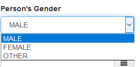
The selected value will be of course in the Gender property when the form is submitted. Furthermore, it is possible to use a multiple choice list as well as a radio button group with enums.
Small Issue Encountered
Creating a radio button involves essentially creating an <input> element with the type attribute set to radio: <input type="radio">.
Some changes have been made to the FormGroupBuilder.buildInputHtml method to support the creation of a radio button, these changes include setting the InputTagHelper.Type property.
Setting the InputTagHelper.Type requires to add a type attribute to the TagHelperAttributeList used for rendering the InputTagHelper. Otherwise an InvalidArgumentException is thrown during the processing
of the tag helper.
Closing Thoughts
Implementing support for multiple choices turned out to be easier than I thought, it only required the creation of the [ItemsSource] custom attribute and some changes to the existing FormGroupBuilder.
The changes made seemed trivial to me so I didn’t really delve into the details which you can always look up in the usual Github repository.
In the next post we will probably see more functionality.