outline
Sponsored by

Modern CSS layouts with Grids and Flexboxes
When I started web development a while ago, it was very hard for me to lay things out in a web page. I remember how it was painful to place two <div> elements next to each other horizontally. After understanding how the different displays(block, inline, inline-block) works and after discovering concepts like grid systems, properly placing visual elements on a web page started to make sense.
Libraries such as bootstrap and features such as media queries allowed us to build responsive web UIs that can adapt the page’s layout to multiple screen sizes.
But nowadays, we have even better layout systems supported by CSS that we can activate via the display property which are flex-box and grid.
In this post, we are going to explain the basics of these new layouts and we’ll talk about what’s achievable by using them.
Flex-Box
Flex-box is a responsive layout system that allows you to specify the placement of children of a “flex enabled” element. This layout system has been designed with responsiveness in mind; so simply using it makes creating responsive layouts way easier than legacy displays(block, table).
Consider the following example:
Here we have a .container that holds the .element divs and here we wish to lay out the elements horizontally with spacing between them. By using flex-box all we have to do is to enable the flex display on the .container element and specify how elements should be justified(placed horizontally) via the justify-content property.
In the previous, example the justify-content and align-items allows to specify respectively the horizontal and the vertical placement of the elements in the container.
With flex-box it is now very simple to center elements vertically and horizontally inside a container, consider the following example:
Here we made sure to center the number inside each .element by activating the flex layout and by using justify-content and align-items
And this is just the beginning, it is also possible to specify among others:
- the order in which children are displayed
- the wrapping(render on the next line) behavior
- the weight of an element via the
flex-growproperty(which reminds me of Android’sLinearLayout) - the orientation of the flex container which can be horizontal, vertical or a reverse of one of the previous
I invite to checkout this Complete Guide to Flexbox for more details and some examples.
CSS Grids
CSS finally supports a grid system!
It is now possible to specify that an element places its children in a grid. The grid’s “shape” can be specified via the grid-template-columns and grid-template-rows properties.
Consider this example:
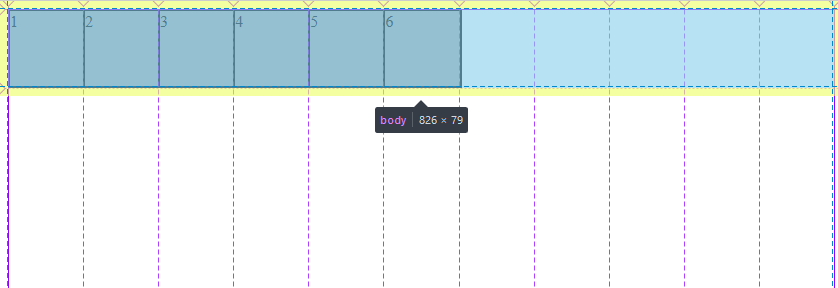
.container is now a 3 columns and 2 rows grid that contains 6 .element divs, note how these elements are properly placed in the grid. But what about responsiveness?
It is possible to use the auto-fit value when specifying the number of columns in the grid-template-columns property:
In the previous example, you can see that we used the minmax function to specify the width bounds of each column; the max bound has the strange fr unit which represents a fraction of the screen given the number of columns.
By progressively downsizing the screen, you will notice that the columns are rearranged in rows when the screen gets too small which is basically the behavior of responsive grids.
For a more complete comprehensive reference to css grids, please checkout this Complete Guide to Grid.
Finally check this out, by using firefox dev tools inspector it is possible to x-ray the css grid as shown in the following screenshot:
Closing thought
Very useful layout systems are now baked into vanilla css.
In a previous post, I said that ES6 was upping the value of JavaScript as a universal application development language and I am glad to see that the same spirit of improvement is also getting to CSS.